Featured Faculty
Professor of Psychology, Weinberg College of Arts & Sciences; Professor of Design, McCormick School of Engineering (Courtesy); Director, Northwestern Cognitive Science Program; Professor of Management and Organizations (Courtesy)
Lauren Manning
You have a great idea to grow your business, be it a new product, a clever marketing strategy, or a novel approach to organizing the company. The idea is based on solid data. How do you convince your skeptical boss, staff, or clients of your brilliance?
Show them your data visually, says Northwestern Professor Steven Franconeri.
“People might think that visualizations are pretty and they’re icing,” Franconeri says. “That’s not true. They are indispensable, absolutely indispensable.”
Around 40 percent of our brains are devoted to visual comprehension, Franconeri says. “It’s critical that you use that machine.”
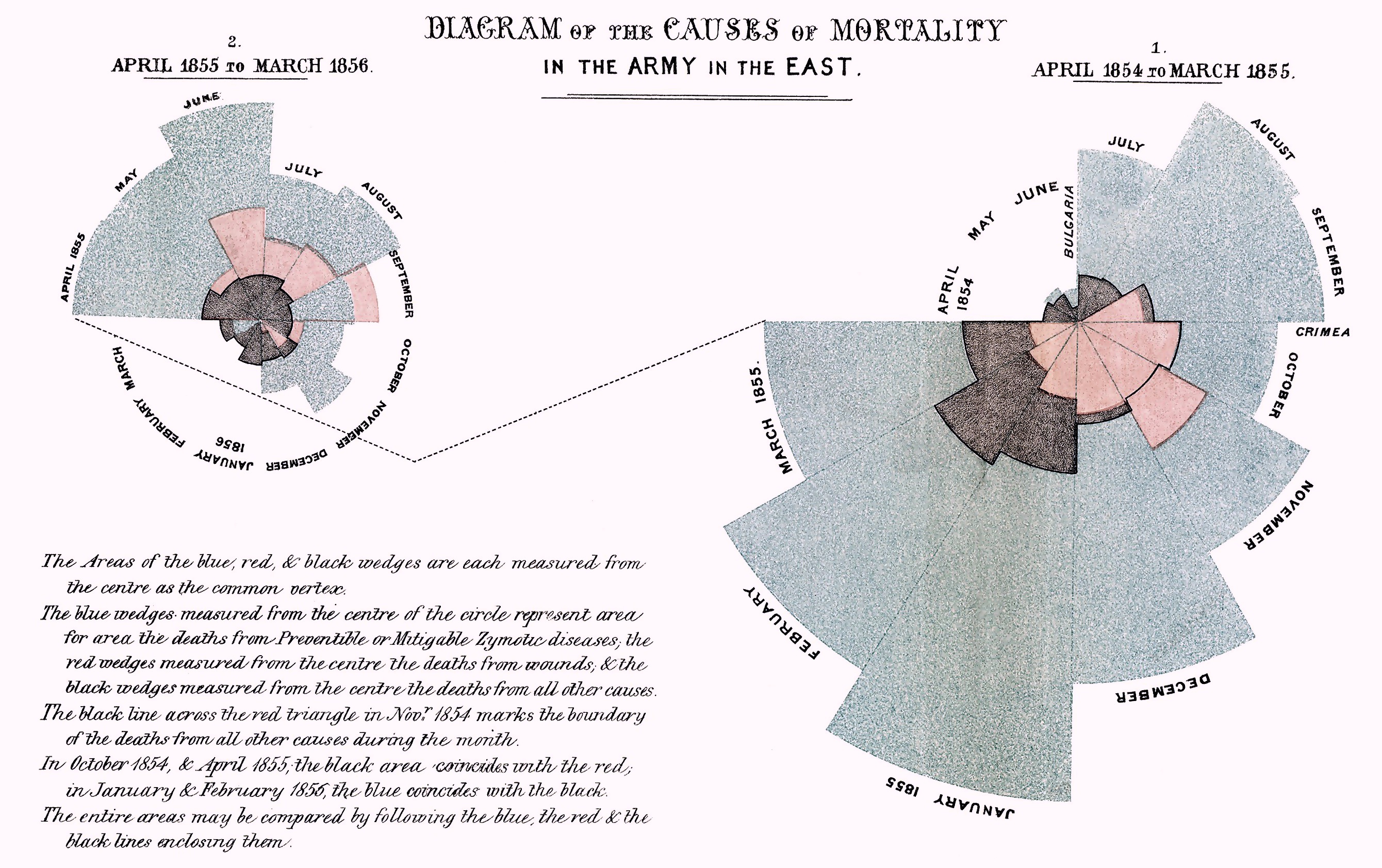
And while data visualization has been around for more than 100 years—Florence Nightingale was an early pioneer who used a visualization to prove that more soldiers died while lingering in hospitals than on the battlefield—it has gotten far more sophisticated in the past decade or two. The technology for displaying data has improved, and research is establishing best practices for communicating data visually.
This boom has led to some rules about how to best present your data. Yet Franconeri, a psychology at Northwestern and a professor of leadership at Kellogg (courtesy), says far too few people learn those rules. And it comes at a cost: bad visualizations.
“If you do it wrong, it’s a disaster,” he says. “It can be complete spaghetti.”
The way you display your data depends on the story you want that data to tell. So it follows that the people at the forefront of data visualization today are trained storytellers.
“The folks who are doing the most interesting work on the storytelling front are journalists,” Franconeri says. They are the people whose job it is to take complex ideas and distill them in digestible, memorable ways. The New York Times, for example, is doing highly innovative data visualization, Franconeri says.
As journalists have gotten more sophisticated in their visualizations, researchers like Franconeri have started designing studies of their techniques to determine what styles of visualization are working best and why.
“If you do it wrong, it’s a disaster. It can be complete spaghetti.”
Beyond acting as research topics, journalists’ visualizations are a great place for business people to browse for inspiration, Franconeri believes.
Take, for example, this interactive graphic that looks at the rising rate of motorcycle deaths, and this one that looks at deaths from preventable diseases. In both, from The New York Times, the viewer is guided through several sets of related data with an animation that causes one visualization to flow into another.


Franconeri uses this example to show how our brains can sort quickly when given visual information. Look at the first grid (with no formatting) and try to pick out the highest and lowest numbers. Now, look at the final grid (in tan, white, and purple) and try to do the same thing. You should find the task much easier, thanks to straightforward color-coding. The other two grids are less effective because the color-coding is counterintuitive (in grayscale) or difficult to see (in red and blue). Credit: Steven Franconeri
“It’s taking a big complex data set and guiding people through one snapshot at a time so that they understand the big picture through a guided tour,” Franconeri says.
And all the rules that apply to good journalistic visualizations also apply to the business world.
So what are those rules?
If you don’t know the answer, Franconeri says you are unfortunately in good company.
“Nobody ever gets taught these rules. You take writing classes in college. You don’t take a graphical communication class,” he says. Yet, “this is a skill that people need to have. If you learn these rules, it will have a multiplicative impact on how well you can convey your ideas to people and how well those ideas will actually sink in and then lead to action.”
Franconeri offers up a few rules of thumb.
If you have a relatively simple data set, create three or four different visualizations. “Make them as different as possible,” he says. “Show those to some colleagues. Ask them what story they see in each one. You’ll be surprised at the differences in what people extract from the same data.” Those interpretations can then be used to shape your final product.
With a more complex data set, keep in mind that your viewers can quickly get overwhelmed even if you and your designer understand the visualization completely. Because the visual-processing centers in our brains are so strong, it is easy for designers to feel completely comfortable with a complex visualization because they have been immersed in the data. Viewers, however, struggle without that background.
“Their brain is lit, but they don’t know what to do with it all,” Franconeri says.
Other rules come from his research into specific types of visualizations.
One of his forthcoming papers looks at a new type of graph called a connected scatterplot. It takes a style of graph that is familiar to most of us—a simple scatterplot—but combines two time-related sets of data instead of just displaying each one in a separate graph.
In this example from The New York Times, the connected scatterplot shows miles driven by Americans each year as well as auto fatalities each year. In a traditional scatterplot graph, time would run along the x-axis with the y-axis showing either miles driven or deaths. Instead, a connected scatterplot combines the data from the two y-axes and lets time run as an annotated line across the graph. When Americans on occasion reduce their driving from one year to the next, the line goes backwards. In one spot it even creates a loop. Most viewers do not expect a line on a graph to behave that way.
This sort of innovative visual display is exciting to Franconeri. But he wants to know if it is actually effective. In a series of experiments, he had students and randomly selected participants look at connected scatterplots as well as more traditional graphs.
In one experiment, participants were shown thumbnails of six graphs, three of them connected scatterplots and three of them more traditional graphs. Participants were given five minutes to explore the graphs and could click on any thumbnail to view it larger.
Franconeri and his coauthors, Steve Haroz, a researcher in Franconeri’s lab, and Robert Kosara of Tableau Software, found that participants spent the majority of the first two minutes looking at enlarged versions of the connected scatterplots. This means that the format is highly effective at grabbing viewers’ attention and that people are not immediately turned off by the unfamiliarity of the format.
In other experiments, participants were asked to answer questions about their understanding of the connected scatterplot graphs. The researchers found that, for the most part, they understood the data quite well.
The places where viewers got hung up led the researchers to offer some concrete advice to designers of these graphs. For example, they recommend having clear annotations for unfamiliar features, like loops in the time line. It would also be useful to have linked views to smaller, more traditional visualizations of the data in specific spots that viewers could click on.
Overall, Franconeri deems this type of cutting-edge visualization a success.
When Franconeri teaches business students and leaders, he advises them to step away from the traditional bullet-pointed slides and start integrating visuals into their presentations.
Because our brains use the same systems to process speech and written language, putting up text on a screen while talking “ensures that you won’t get your point across, because no one can read and listen at the same time” he says.
But, he says, “you can look at pictures and listen at the same time at full blast.” To convince your audience of your point, “the visualization part is not optional.”
Steve Franconeri teaches in Kellogg Executive Education’s The Strategy of Leadership program.
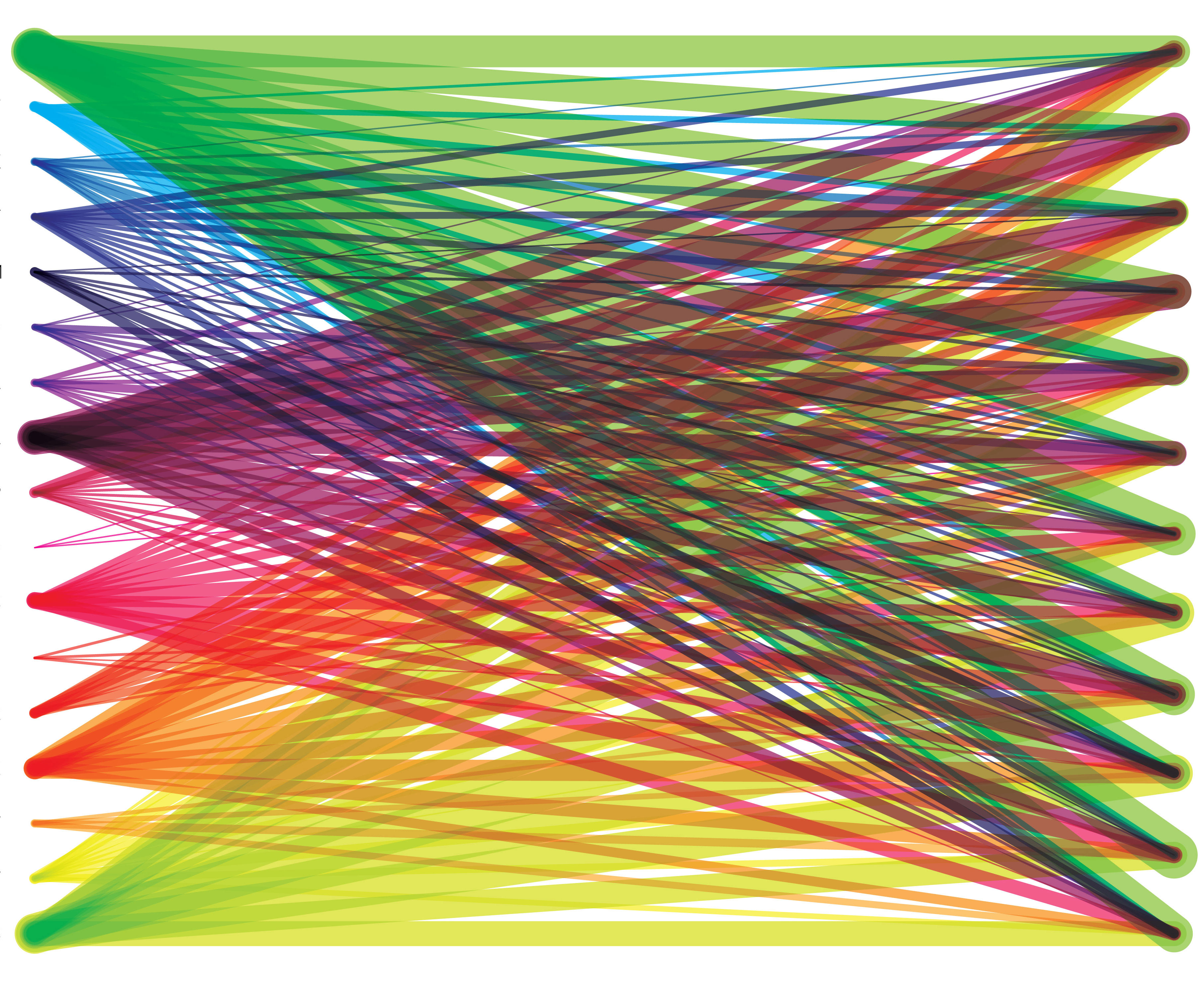
Image credit belongs to Lauren Manning. Published under a Creative Commons license. Image has been modified by removing labels.
Haroz, Steve, Robert Kosara, and Steven L. Franconeri. “The Connected Scatterplot for Presenting Paired Time Series Data.” Manuscript submitted for publication.