Marketing Mar 12, 2019
Good Brand Design Appeals to Consumers on an Unconscious Level
An excerpt from “Kellogg on Branding in a Hyper-Connected World” uses an iconic brand—Coca-Cola—to illustrate the power of design thinking.

Yevgenia Nayberg
Marketers are too often relegated to liking or disliking a brand design that is handed to them by a “real” designer. One approach—known as “design thinking”—aims to change this. Design thinking licenses nondesigners to become active participants in the design process. But before marketers start whipping up prototypes, they need to understand some basics about how various design elements can work together to unconsciously influence perceptions.
In the following excerpt from his chapter “Brand Design and Design Thinking” in Kellogg on Branding in a Hyper-Connected World, Kellogg marketing professor Bobby Calder explains the power of unconscious associations. He also explains why one classic brand, Coca-Cola, is so effective.
The key to brand design lies in an understanding of the psychology of branding. First, it’s important to understand that good brand design mainly influences consumers on an unconscious level. In this vein, Nobel Laureate Daniel Kahneman refers to System 1 (unconscious) and System 2 (conscious) thinking. Let’s take a look at these concepts in closer detail.
System 1 and System 2 Thinking
For our purposes, System 1 thinking involves the unconscious associations triggered by a brand design. By contrast, System 2 thinking is slow, conscious, deliberative thought. Consumers who pay conscious attention to an advertisement’s content are engaged in System 2 thinking. When consumers see the word “pure” as part of a brand design, they typically process this through System 1. In System 1, both verbal and visual cues along with other cues trigger associations that form a perception that can influence behavior without any conscious realization. And these associations may shape subsequent System 2 conscious reflection as well.
Excerpted and adapted with permission of the publisher, Wiley, from Kellogg on Branding in a Hyper-Connected World by Alice M. Tybout and Tim Calkins. Copyright (c) 2019 by John Wiley & Sons, Inc. All rights reserved. This book is available wherever books and ebooks are sold.

Consumers might or might not spend time consciously thinking about a brand in a System 2 way. Yet it’s important to note that successful brand design is not predicated on this. A marketer approaching brand design in making mode must understand that the goal of the design is to create the desired System 1 associations at an unconscious level; an effective brand design is one in which all of the design elements cue the intended System 1 associations. Establishing associations in the consumer’s mind that lead the consumer to recognize and interpret the brand without cognitive effort creates a perception that is consistent and supportive of the brand’s positioning concept. To this end, the brand design should begin with a clear vision of the associations that the brand design is intended to create. With these associations clearly identified, you can then prototype (make a preliminary version of) the design cues. It is very difficult to accomplish this in the usual “tell” mode of marketers. But a design-thinking marketer can participate in making cues by working in tandem alongside the designer, who contributes the technical skill of creating and polishing the design.
Coca-Cola: An Example of System 1 and Brand Design
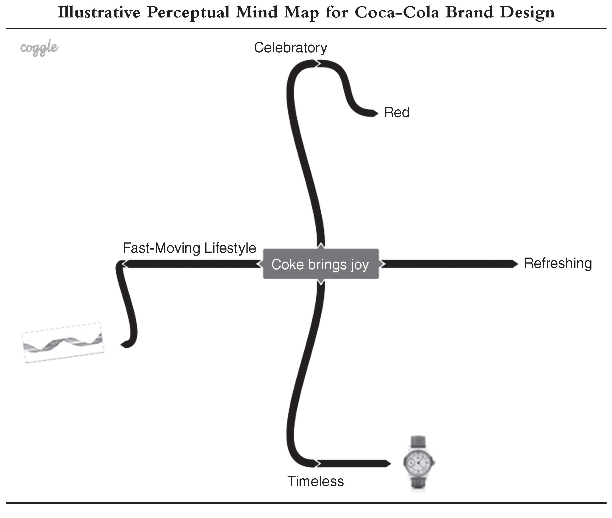
Let’s use an example of a very familiar brand to illustrate the process. At this writing, the brand positioning of Coca-Cola for targeted consumers is something like this: Coca-Cola is a thirst-quenching cola with a refreshing taste that brings joy to everyone. The company uses both advertising and content marketing to try to get consumers to think about (System 2) the concept that “Coke brings joy.” Yet, considerable resources are devoted to brand design as well. The goal is to create System 1 associations that support the concept. The associations are depicted in a perceptual mind map (see Figure 7.2) of Coca-Cola’s traditional identity equities: that it is refreshing and timeless. It has always been enjoyed by people all over the world. But it is also culturally in tune with contemporary associations about time. Currently Coca-Cola connects to consumers who associate themselves with a fast-moving lifestyle in which there is little time for personal enjoyment. Coca-Cola is about taking the time to enjoy a celebratory moment.

The key to brand design is having a clear view of the associations that are the design objectives. Because System 1 is automatic, fast, and nonverbal, there is no need for a long brief, such as those used for advertising. Identifying and focusing on three or four key associations is usually enough to guide the design effort. Using a perceptual mind map to show the desired associations (as in the above graphic) is a good way to remind the design team that the design should be intended to cue the consumer to make a few fast System 1 connections, which together lead to a strong perception of the brand. Visuals can help make the desired associations even more clear. Designers often find visual representations of design intent, or mood boards, especially useful.
The classic watch in this graphic visually conveys the intended timeless association of Coca-Cola. The flowing ribbon likewise captures the dynamically changing quality of a fast-moving lifestyle. The key point is that the design should concentrate on triggering associations. Continuously checking the brand design against the perceptual mind map helps maintain this focus. Any other criteria, such as functionality, competitive differentiation, or design aesthetics, should ordinarily be secondary considerations. A good design will produce a few strong associations that cause consumers to recognize the brand and interpret it perceptually as intended. A design that fails to do this is a bad brand design.
The next time you encounter a Coca-Cola touchpoint (a store display, someone drinking a Coke, a soda machine), think about the design in terms of the associations pictured in above graphic. Notice that every aspect of the design relates to the associations. The flowing Spenserian script of the name cues both timelessness and movement. This is reinforced by the dynamic contour ribbon that mimics the shape of the bottle laid on its side. The basic red color is celebratory. Clearly picturing the associations and attendant perceptual meanings has allowed marketers (and designers) to make sure that each component of the design does its job.


