Featured Faculty
Policy Nov 2, 2021
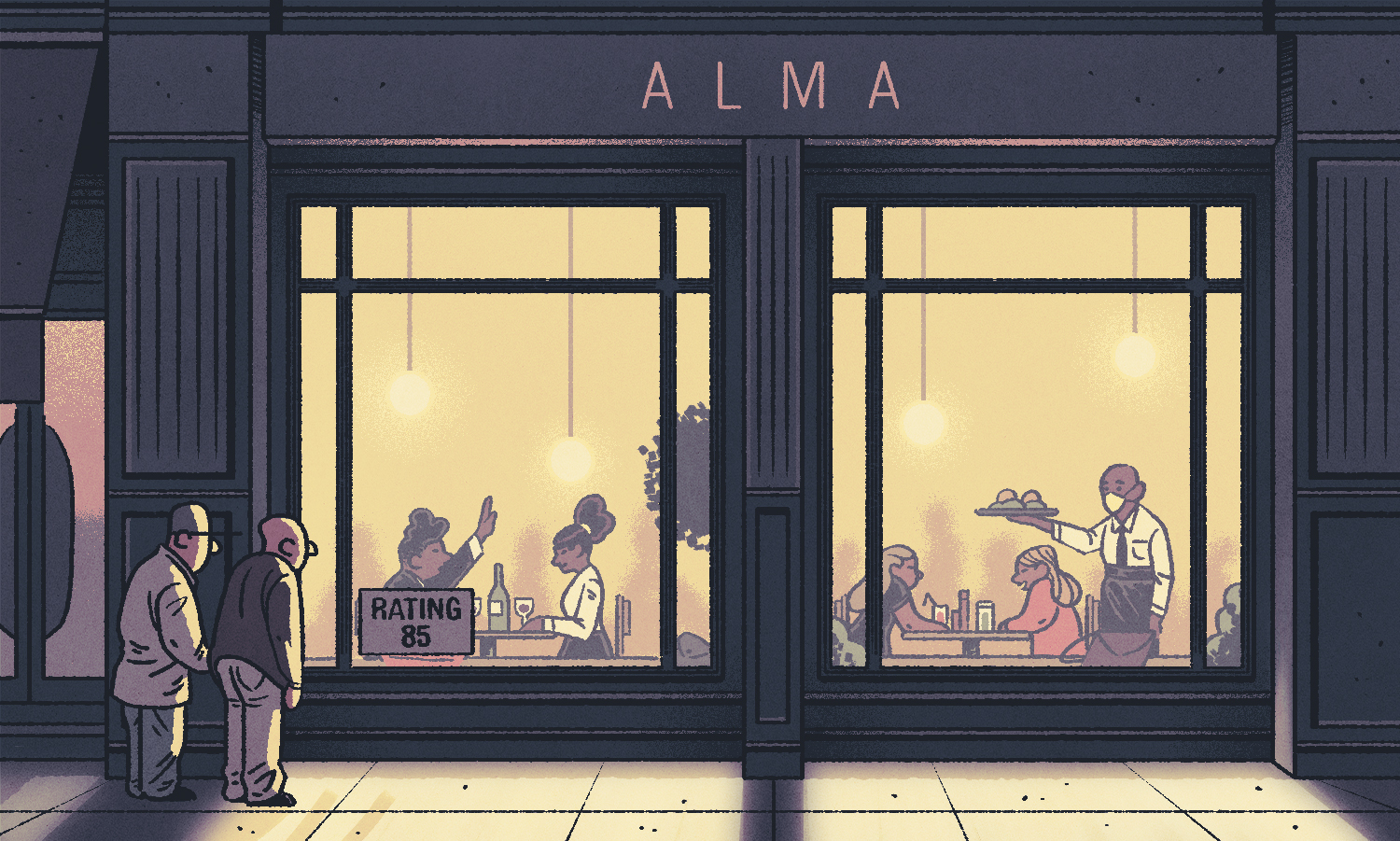
The Health Department Gave Your Favorite Restaurant an 85. What on Earth Does That Mean?
Regulators should consider tweaking their scoring systems to make food-safety ratings more informative.
Michael Meier
Here’s a Friday-night scenario that may sound familiar: You’re out with friends looking for a place to eat. You pass a few restaurants, peruse their menus, assess the ambiance, maybe read Yelp reviews on your phone. The astute diner might also check the restaurant’s food-safety score, often posted in the front window. Let’s say the score is 85 out of 100. That seems pretty good, right?
Not necessarily. Depending on an area’s rating system, an 85 might be quite low relative to other restaurants, signaling multiple high-risk safety violations, something which rarely occurs. And if potential customers don’t understand that, then the ratings aren’t conveying their intended public-health message.
Daniel Martin, an associate professor of managerial economics and decision sciences at Kellogg, and a colleague recently studied the gap between what regulators want to convey with these scores and what consumers actually perceive.
The team focused on San Francisco’s 2018 restaurant hygiene ratings and found that people interpreted low ratings (the equivalent of a C) as much less risky—and much more common—than they actually were. And on the other end of the spectrum, they thought restaurants with the highest scores (the equivalent of an A+) were more risky than they were in reality. They also found that consumers thought low ratings occurred more often than they actually did.
“These misperceptions made having a C less bad and made having an A not as good,” Martin says. The trends persisted even when the team provided participants with more information about the rating system, such as descriptive labels and brief explanations of what various score ranges meant.
Regulators “should care what consumers are internalizing.”
— Daniel Martin
The muddled messages provided by the ratings could have repercussions for businesses and public health. If consumers do not value a high rating enough to compensate a restaurant for the additional health and cleanliness measures, the restaurant has little motivation to continue. And poorly rated restaurants may not have as much incentive to improve.
Regulators “should care what consumers are internalizing,” Martin says.
Regulators might need to change their scoring systems or make rating signs more informative about the health risk to bring consumers’ interpretations in line with reality. Indeed, San Francisco’s public-health department tried just that last year by adjusting the way ratings are displayed; descriptive labels are now much larger, and placards don’t show a numerical score at all.
Message Received?
Ratings are ubiquitous: We give scores to everything from hair salons to rideshare drivers to vacation rentals. And regulators issue ratings for organizations or products such as hospitals, nursing homes, and healthcare plans.
Martin, along with Tami Kim in the marketing department at the University of Virginia, focused on regulators because the purpose of their ratings is very clear: the scores allow consumers, who don’t have the experience or access to judge for themselves, the ability to make better-informed decisions.
The researchers wondered whether regulators were achieving their goal of communicating information to consumers. “The regulator says, ‘This nursing home is a 3. This health plan is a 4. This restaurant is a B.’ They’re trying to say something,” Martin says. “But what are consumers receiving from that message?”
To find out, Martin and Kim obtained data on 1,759 restaurants in San Francisco that had been rated from January to April 2018. Inspectors had visited restaurants at unscheduled times and assigned a score based on the types of public-health risks that they had observed. For instance, a low-risk violation could include washing fruits and vegetables incorrectly or having dirty toilets. Moderate violations could include difficult access to handwashing facilities or re-serving food that had already been given to other customers. And issues such as contaminated food or certain vermin infestations would be considered high-risk.
Under the system at the time, scores ranged from 0 to 100 and were grouped into categories. A rating over 90 (“Good”) meant that inspectors had usually seen only low-risk violations; 86–90 (“Adequate”) meant several violations; 71–85 (“Needs Improvement”) meant several high-risk violations; and less than 71 (“Poor”) was the worst category.
The scorecards posted in restaurants showed the numerical rating in a large, color-coded box—green for the Good or Adequate categories, orange for Needs Improvement, and red for Poor. Smaller text underneath the number listed the four possible categories and corresponding score ranges.
However, the placards didn’t explain what each category meant in terms of the number or types of violations. They also didn’t clarify how that restaurant scored compared with others.
Muddled Perceptions
So the researchers ran an online study and asked participants how they interpreted various ratings—focusing first solely on numerical scores.
About 380 participants were asked to estimate how many restaurants out of a random sample of 100 would fall into various score ranges: 96–100, 91–95, 86–90, and so on. For some of the score ranges, they also estimated how likely it was that a restaurant in that range had a high-risk violation.
The team found that, without any additional context, people tended to believe that low scores were more common than they actually were. For instance, participants in this baseline condition estimated that 11 percent of restaurants had a rating of 0–70, when in fact less than 1 percent did. And they thought that only 17 percent of restaurants scored 96–100, when the real figure was 37 percent.
People may have assumed that scores are somewhat equally distributed, Martin speculates. Perhaps based on our experiences in school, we expect that “the regulator or the grader wants to give a range of grades,” he says. After all, it’s the differences between grades that convey information about which restaurants are better than others.
Similarly, these participants misinterpreted the health risks. They estimated, for instance, that a restaurant with a 71–75 rating had a 33 percent chance of having a high-risk violation, when it was actually 91 percent. And they thought a 96–100 score signified a 13 percent chance of a high-risk violation, when the real figure was zero—suggesting the misinterpretation went in both directions, with high-scoring restaurants not getting the credit they deserved.
Does More Information Help?
Next, Martin and Kim wanted to know how consumers’ perceptions shifted when they were given more context to help them interpret ratings. So they ran an experiment with two other groups of online participants.
Both groups were told how the restaurant-rating scores were roughly distributed. But one of the groups received additional information about what each range meant. For instance, they read that a score of 71–85 was labelled “Needs Improvement” and meant that inspectors had seen multiple violations, usually including several high-risk ones.
Being given detailed descriptions of each category nudged participants’ guesses for most score ranges in the right direction, but people still greatly underestimated the chances of high-risk violations at low-rated restaurants. They also still overestimated the chances at the highest-rated restaurants.
“The interventions only slightly ameliorate the effects,” Martin says.
Political Pressure
So what else could regulators do?
One possibility would be to provide more detail about the number and types of violations found at each restaurant on its rating sign. Or regulators could distribute ratings more equally so that they better match people’s expectations of the numbers’ meaning. For instance, restaurants with several high-risk violations could be assigned scores in the 60s, while only restaurants with absolutely impeccable hygiene would score above 90.
But regulators may have to contend with political issues. Giving a score of 65—essentially a D—to a mom-and-pop restaurant could severely hurt the business. Regulators might be under pressure to avoid driving too many customers away, so that the restaurant has a chance to improve and succeed.
San Francisco’s new rating display, rolled out last year, might be a step in the right direction. Instead of displaying a numerical score, restaurants are now labelled in large type as Pass, Conditional Pass, or Closed and more brightly color-coded as green, yellow, or red, respectively. However, the impact of the new system still depends on the accuracy of consumers’ inferences when they see Pass or Conditional Pass. And by losing all nuance among restaurants in a given category, the new system runs the risk of punishing the most hygienic restaurants even more than the old rating system did.
Restaurant owners themselves could also provide customers with more information if they’re worried that scores are being misinterpreted. For instance, a restaurant with a high rating could post a note explaining that this means they had no high-risk violations.
But customers may not trust that information, Martin says. “Part of the reason we have certifiers is that they have more credibility than firms,” he says. “It’s a tricky thing for firms to fix because they’re maybe seen as less benevolent.”
The study also raises the question of whether consumers misunderstand the meaning of ratings assigned to hospitals, nursing homes, and healthcare plans. In those cases, making the right decision could be more critical than choosing where to grab dinner.
Still, with restaurant ratings, “there’s a pretty strong public-health reason to get this information across,” Martin says. “Even if it isn’t as high-stakes as nursing homes, it matters.”
About the Writer
Roberta Kwok is a freelance science writer based in Kirkland, Washington.
About the Research
Kim, Tami, and Daniel Martin. 2021. “What do consumers learn from regulator ratings? Evidence from restaurant hygiene quality disclosures.” Journal of Economic Behavior and Organization. (185): 234–49.
Insight in your inbox
Receive our newsletters to keep up with the latest research and ideas from faculty at the Kellogg School of Management.
This website uses cookies and similar technologies to analyze and optimize site usage. By continuing to use our websites, you consent to this. For more information, please read our Privacy Statement.