Featured Faculty
Professor of Psychology, Weinberg College of Arts & Sciences; Professor of Design, McCormick School of Engineering (Courtesy); Director, Northwestern Cognitive Science Program; Professor of Management and Organizations (Courtesy)

Riley Mann
We’re used to seeing a certain kind of graph in business settings: a chart with each bar in a different color, plenty of labels, and text. And presenters often let the data simply speak for itself: Voilà! Got it?
But many data-visualization gurus advocate for a different approach. One method, called decluttering, involves making graphs look cleaner so that the audience can more easily process the information. Another method, called focus, highlights the information or trend that the presenter wants people to notice—for instance, making one bar red and all of the others grey.
Steven Franconeri, a psychology professor at Northwestern and a professor of marketing at Kellogg (courtesy), and his colleagues wondered if these techniques truly worked. Did decluttering or focusing help presenters get their message across?
In a study with college students, they found that using the two methods in combination did help people grasp the chart’s main takeaway more clearly. But without focusing, decluttering alone didn’t have much benefit beyond making a visualization look a bit more professional. People were just as likely to miss the point as when they saw a cluttered graph.
“We didn’t find the cognitive benefits that were predicted,” Franconeri says.
Some presenters may think the focus technique isn’t necessary because the pattern “screams out to the audience,” he says. But what seems obvious to an expert may not be to an audience.
Presenters have “a curse of expertise,” Franconeri says. “They see what’s important in a graph, and they think the audience does too. They are typically wrong.”
The research suggests the importance of not just letting data speak for itself and the advantage of using multiple techniques to guide people toward a desired conclusion.
Graphs are ubiquitous in business presentations because appealing to people’s visual system “can be super powerful,” Franconeri says.
But many of these charts fail to effectively communicate their message. They’re often confusing or leave people unsure of the main conclusion. “Most data visualizations that are shown in business settings have some fundamental design flaws,” he says.
The declutter technique, advocated by many data-storytelling books, involves removing extraneous visual elements. For instance, presenters are advised to delete borders, gridlines, tick marks, and unnecessary labels of data values. And instead of using the entire rainbow, they should minimize the number of colors or make everything grey or black.
For the focus technique, presenters are told to add a clear headline or text explaining the key trend in the data. For example, it could read “X is rising twice as fast as Y” or “A and B are the two most important factors.” They would then call out that pattern by making the relevant bars or lines a different color than the rest of the chart.
Franconeri’s team—which included Kiran Ajani, Elsie Lee, Cindy Xiong, and William Kemper, then at Northwestern University, as well as Cole Knaflic, CEO of the company Storytelling with Data—wanted to quantify the effectiveness of these techniques.
In particular, the researchers wondered if the declutter technique would have the benefits that gurus claimed. The assumption was that a sleeker design “would remove the information firehose and make people able to focus on the data,” Franconeri says. But his team speculated that it might not be that hard for audiences to filter out gridlines or labels.
“People have a lot of experience looking at such clutter, and they’re able to tune their brain to shut those things out,” he says.
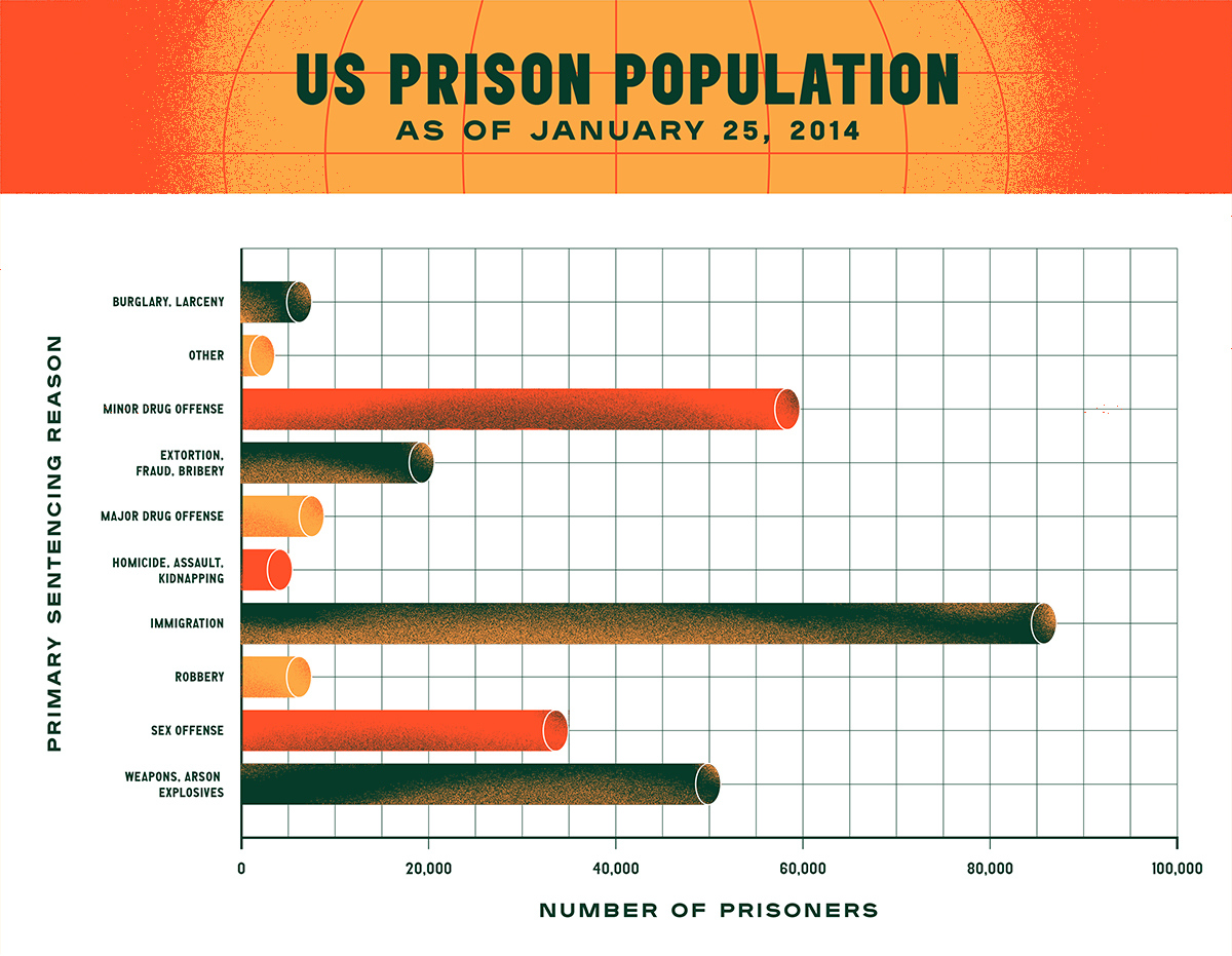
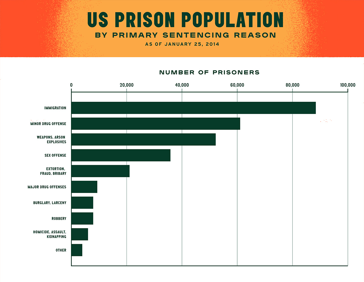
To test the techniques, the researchers assembled six graphs that presented data on different topics. For instance, one bar graph showed drivers’ top design concerns for a new car model, and a line graph showed how people’s news sources had changed over time.
For each graph, the team created three versions. One was a cluttered graph with plenty of excess graphical detail. The second was a much sleeker, decluttered version entirely in shades of grey or black. And the third was decluttered and focused, with the key trend called out in a different color and explanatory headline or caption. (The team didn’t create graphs that were cluttered and focused because the focus technique generally requires decluttering first to make the relevant trend stand out.)
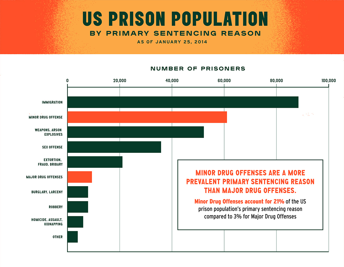
For example, in the line graph about changing news sources, the team added the headline “An increasing proportion cite the internet as their primary news source,” with the word “internet” in bright blue. The lines and labels for “internet” on the graph were also bright blue, while those for other news sources (television, radio, newspaper, and friends) remained grey.
The researchers then showed the graphs to 24 students and community members at Northwestern. Each participant saw two versions of three data stories. After looking at each graph for 10 seconds, they were asked to redraw the chart by hand. They also wrote down what the graph was about and its main conclusions. Finally, participants were shown all three versions of each graph and asked to rate the charts on aesthetics, clarity, professionalism, and how trustworthy the presenter seemed.
When the team compared responses for cluttered versus decluttered graphs, they found that people did consider the decluttered versions more professional looking. But, importantly, when it came to redrawing the chart or describing its conclusions correctly, participants who saw the decluttered version didn’t perform significantly better.
Adding the focus technique, on the other hand, had a significant effect on comprehensibility. Compared with people who saw a decluttered-only graph, participants who were shown a graph that was both decluttered and focused were around 2.5 times more likely to capture the main conclusion in their written descriptions. And they did a better job of redrawing the relevant trend.
“People absolutely had better memory for the highlighted pattern,” Franconeri says.
People also rated the focused graphs higher on aesthetics and clarity than the decluttered-only graphs. But some participants had gripes about the design. In written comments, a few complained that the focused charts seemed untrustworthy because the presenter appeared to be pushing an agenda.
Franconeri says presenters should be aware of the risk that the focus technique can come off as heavy-handed, but he thinks the cognitive benefits outweigh this potential downside. “The vast majority of people will appreciate being guided to the right pattern,” he says.
Because decluttering appeared to impart a sense of professionalism, it’s still worth using that technique—and most importantly, it helps pave the way for the focus technique, Franconeri says. To draw attention to a trend, the color palette needs to be reduced so that the important lines or bars can pop. Presenters should keep the number of colors to a maximum of two, and ideally one, he says.
The study suggests that audiences are used to clean visuals that guide their attention to key elements, such as those on The New York Times’ Upshot section, FiveThirtyEight.com, and other media sites. Business presenters should follow suit.
“Pasting straight from Excel is not going to cut it anymore,” Franconeri says.
Some presenters may be able to get help from their organization’s graphic designer with more straightforward tasks such as decluttering. But not all of the work can be outsourced. You are the expert on your own data, so unless the designer interviews you to “download your brain,” they may not know which pattern should be highlighted and how to annotate it, Franconeri says.
“You typically cannot delegate this to someone else,” he says. “Anyone presenting data to other people needs to know the basics of data storytelling.”
Roberta Kwok is a freelance science writer in Kirkland, Washington.
Ajani, Kiran, Elsie Lee, Cindy Xiong, Cole Nussbaumer Knaflic, William Kemper, and Steven Franconeri. 2021. “Declutter and Focus: Empirically Evaluating Design Guidelines for Effective Data Communication.” IEEE Transactions on Visualization and Computer Graphics.