Do you spot the problem here? Although many of us have heard the phrase “correlation isn’t causation,” some of us have a harder time separating the two in practice. In this case, the relationship between app payment and spending could be causal, but it also might boil down to another simple fact: people who download the app are already your best customers.
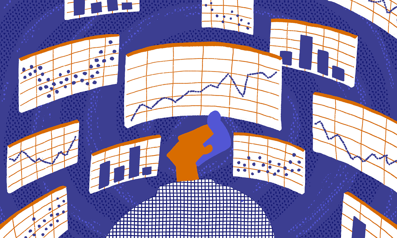
The problem can get compounded when graphs and other data visualizations enter the picture. That’s because our powerful visual system is designed to seek out patterns. In fact, according to new research from the Kellogg School, how data are visualized can significantly impact our interpretation of what we’re seeing—sometimes for the worse. Specifically, the study found that efforts to simplify charts by grouping data into smaller numbers of “buckets” (say, two bars on a chart as opposed to ten) seemed to lead people to mistake correlation for causation.
“How you show your data really matters,” says Cindy Xiong, who received her PhD in psychology from Northwestern and is now at the University of Massachusetts, Amherst, and the lead author of the study. “Your design decisions are going to trigger different initial reactions from people and eventually different decisions from people.”
In a business context, those decisions can be costly, says Joel Shapiro, a clinical associate professor of data analytics at Kellogg and a coauthor of the study.
“We see a lot of companies taking key business outcomes—customer retention, employee retention, patients adhering to their medication, whatever it might be—and doing big-data-mining exercises,” he explains. But if the visualizations used to present the results of that data-mining push people toward faulty conclusions of causation, then companies may be making strategic investments that do not work out as planned.
So, viewer beware: “Graphs can be powerful,” says coauthor Steven Franconeri, a Northwestern professor of psychology with a courtesy appointment in Kellogg’s marketing department. But it’s imperative that you know how to pick the right one for the right data. “You can lead your colleagues and customers to think more rationally about these kinds of problems.”
Line Charts and Circles and Bars (Oh My)
The research team—which included Franconeri, Shapiro, and Xiong, along with Northwestern computer science professor Jessica Hullman—started by looking at four common visualization styles: bar charts, line charts, scatterplots, and plain text. They wanted to know whether these styles differ in how “causal” they make the data appear to people.
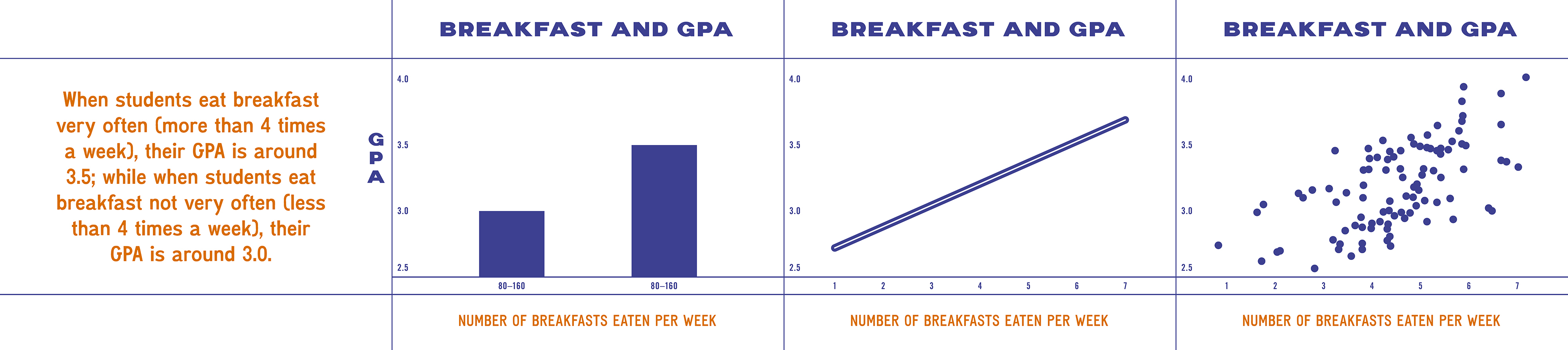
They selected four correlations to display visually: people who smoke more have a higher risk of getting lung cancer; students who eat breakfast more often tend to have a higher grade point average; people who spend more on admission to sporting events tend to be more physically fit; and as more people use Internet Explorer, the U.S. homicide rate tends to increase. While all of these links are correlated (yes, even that last one), they are not all causal. And, importantly, they vary in how plausibly correlated and causal they seem to people, according to an experimental pretest.
Then, the researchers developed four different visualizations of each scenario, similar to those below, to show to 136 online participants.
Each participant saw four visualizations: one representation of each scenario (smoking and cancer, breakfast and GPA, spending and fitness, and Internet Explorer and homicide) in each of the styles (text, bar chart, line chart, scatterplot). In other words, a single participant might see smoking and cancer in text, breakfast and GPA in a bar chart, spending and fitness in a line graph, and Internet Explorer and homicide in a scatterplot. The researchers randomized the order in which the scenarios and visualization styles were presented.
Next, participants were asked to describe in several sentences what they concluded from each of the visualizations they saw. Then they rated from 0 to 100 how much they agreed with two statements. For example, in the breakfast and GPA scenario, participants were asked, “Based on the graph, students who more often eat breakfast tend to have a higher GPA” (an accurate statement of correlation) and “Based on the graph, if students were to eat breakfast more often, they would have a higher GPA” (an inaccurate statement of causation).
For the correlation statements, the researchers found that the type of visualization didn’t observably impact participants’ ratings after they controlled for the relative plausibility of each scenario.
However, for the causal statements, visualization style appeared to matter. Participants rated information they saw in bar charts as the most causal (78 out of 100, on average) and scatter plots as the least causal (an average 67).
More Aggregation, More Assumptions of Causality
What was going on?
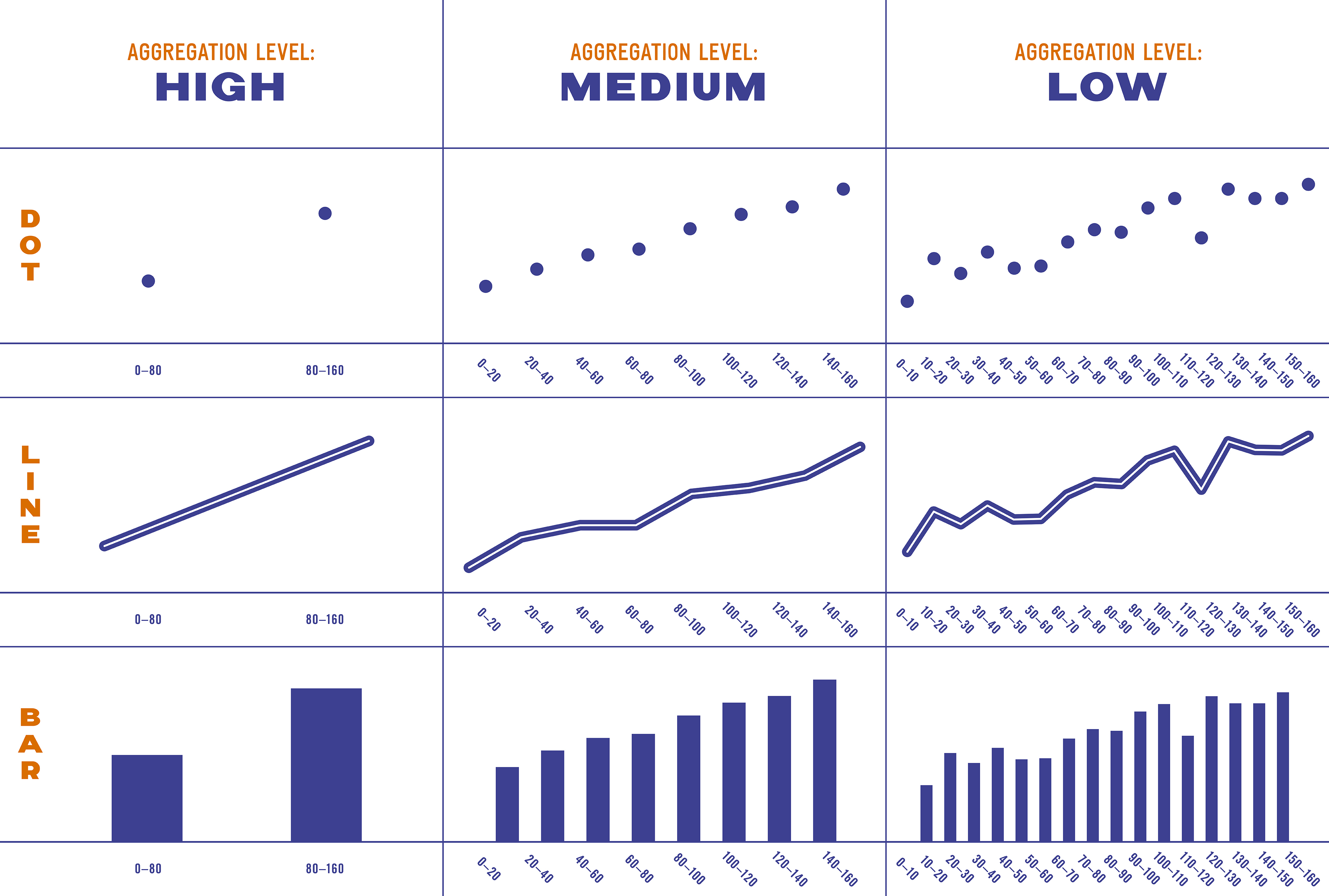
The researchers weren’t convinced that an inherent property of bar charts or scatterplots was really driving this pattern. They suspected that it had to do with the visualizations’ level of “aggregation,” or how many buckets the data were divided into. The bar charts were highly aggregated—that is, they divided the data into just two bars, as compared with the scatterplot, which presented each data point as its own dot.
So the team ran the same experiment again, with a few tweaks. Most significantly, they developed bar charts, line charts, and scatterplots with three different levels of aggregation.
They recruited 129 new participants and repeated the same process as before, once again randomizing visualization style, aggregation level, and the order in which items were presented. They had participants describe the visualization they’d seen, and rate from 0 to 100 how correlated and causal the relationship seemed.
This time the type of chart had only a small effect on participants’ ratings of causality. Much more significant, however, was the effect of aggregation level. Across all different visualization styles, people saw aggregated data as more causal than less aggregated data. In other words, a two-point scatterplot made a relationship between two variables seem more causal than a 16-point scatterplot, and ditto for the bar and line graphs. The researchers hypothesize that people interpret less aggregated data as closer to raw data, where the interpretation is left up to the viewer.
The researchers wanted to make absolutely sure the effects they were seeing stemmed from aggregation and not the type of visualization. So they created an unconventional visualization that eliminated all aggregation and had a new group of participants review them.
The result: across all visualization styles, the non-aggregated visualizations (the ones that show more data values) in experiment 3 were rated as less causal than the least aggregated visualizations in experiment 2.
How to Visualize Responsibly
Does this all point to a single best way to visualize data? Not at all, Xiong says.
“I don’t want to imply there is always a single correct way to show your data. I don’t think that’s the case,” she says. “But I do want to say, be mindful when you aggregate, because the assumption people have may become a causal one. So think carefully about how you present your data and maybe iterate with your own design team or with your data analysts so people don’t misinterpret what you’re trying to say.”
Visualizing carefully is increasingly important in an age when technology has made it easy to capture and present all kinds of data.
“There’s so much measurement, there’s so much good technology, there’s so much computational sophistication,” Shapiro says. But even the most sophisticated tool rarely, on its own, identifies causation. “It’s just really, really good at finding trends.”
So if you see an exciting trend, don’t automatically assume causality, Shapiro cautions—instead, look at it skeptically. Is there anything else that might explain why these two factors rise and fall in tandem? If not, “you can run business experiments to say ‘x actually causes y.’ That’s the next step. But the first step is good critical thinking.”