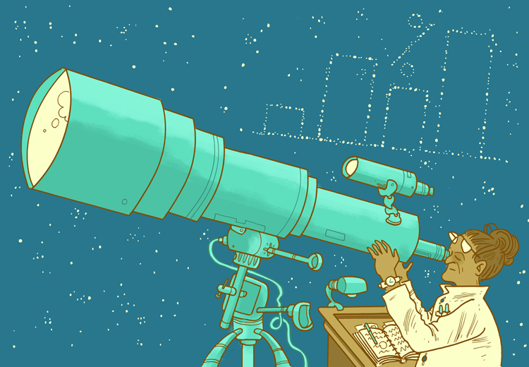
Kellogg professors Steven Franconeri and Joel Shapiro joined Kellogg Insight to discuss how the mind reads visualizations—and how we can use this knowledge to help businesses answer pressing questions.
Franconeri is a professor of management and organizations at the Kellogg School (courtesy) and a professor of psychology in the Weinberg College of Arts & Sciences, and Shapiro is a clinical associate professor and executive director for the Program on Data Analytics at Kellogg.
This interview was edited for length and clarity.
Kellogg Insight: How are ideas about data visualization changing? What are experts learning about how we understand graphs and figures?
Franconeri: People are starting to recognize that visualization is more powerful than tables and statistics—but it’s not omnipotent.
Visualizations are complex, and reading one is like reading a paragraph. It’s not like looking at a picture, where you get all of the information instantaneously.
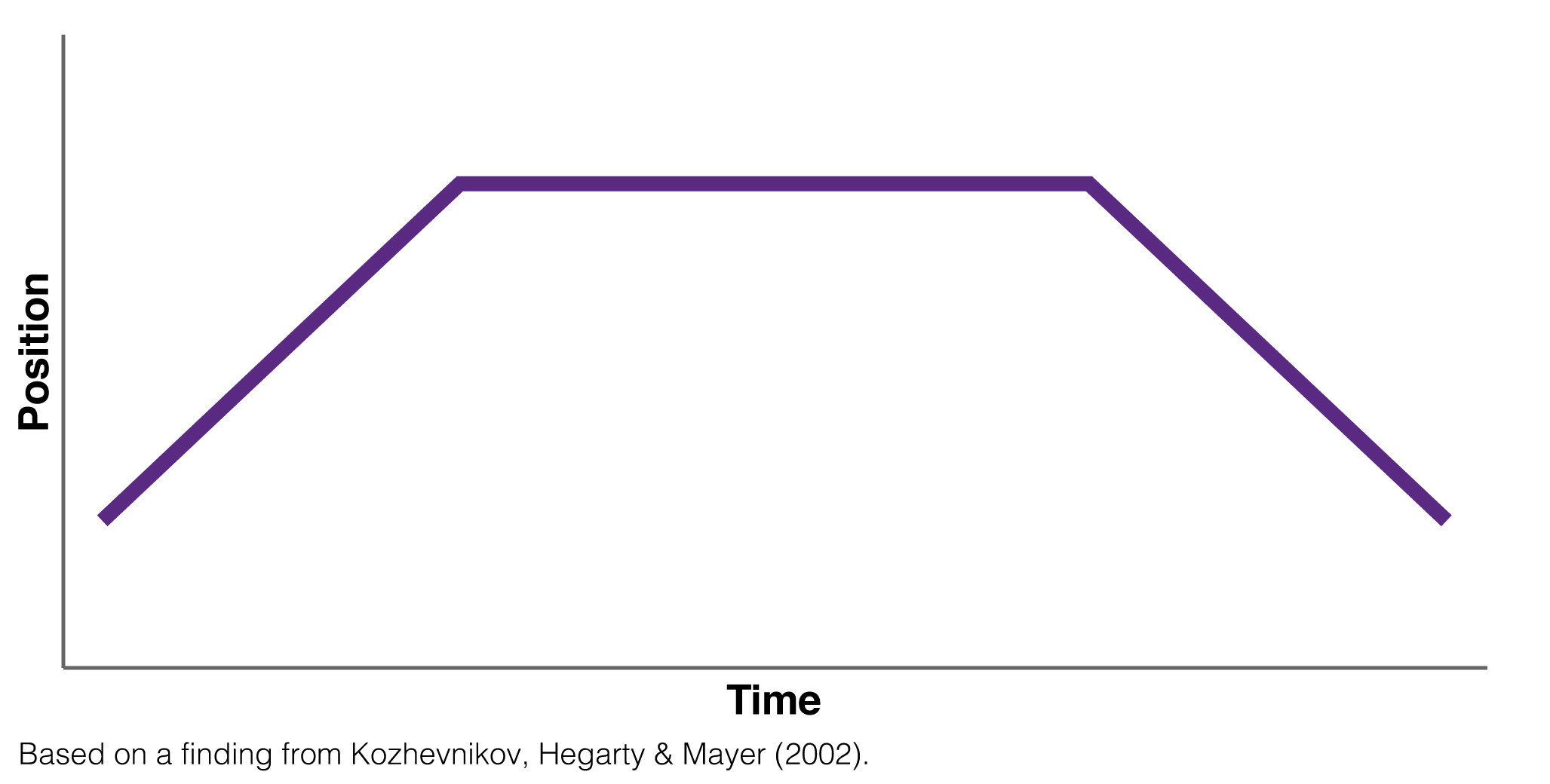
Here’s a good example of this: I’m just going to show you a basic graph. I want you to look at it and give me a sentence that describes what the object is doing.
KI: The object rises, and then assumes a steady altitude, before dropping.
Franconeri: Okay, don’t feel bad at all, because my instinct is to say the same thing. Many people say that it shows a person walking up and down a hill.
That’s totally wrong. That’s treating the graph like a picture from a camera. It’s using the part of your brain that is designed for seeing and understanding the world outside. Graphs are not like pictures that you can process in a split second. You have to inspect them slowly over time.
So for this graph, the object starts off moving, because time is changing, and so is position. (We don’t know in what direction it’s moving.) Then the object is still: time continues moving along, but position is not changing. Finally the object moves again, with both time and position changing.
A visualization is not a 50-millisecond view, where you look at it and you understand what’s happening. It’s a minute-long process.
KI: Interesting. So what should analysts keep in mind when depicting information visually?
Shapiro: Be careful what you choose to show because your audience will assume the visualized data trumps the non-visualized data in terms of importance.
One of the biggest dangers with dashboards, that you see people do all the time, is taking some important business outcome and dividing it up by group, like “revenue by channel, by customer type, by sex, by race, by state,” whatever.
These might be reasonable and accurate and objective things to portray, and they might be empirically correct. But often, people look at the dashboard and think that the groupings are necessarily the cause of the outcomes. That’s really dangerous. If your dashboard shows that customers using your app spend more than customers who don’t use the app, it’s really easy to let a great visualization convince you that the app is the cause of the increased spending. You can easily forget to think, “maybe there’s something else causing the difference.”
Franconeri: There are some studies in the literature that support the idea that visualizations are perversely, irrationally persuasive—that people are much more likely to believe conclusions if they’re visualized than if they’re just given numbers.
There’s a study where they split people into two groups and gave them a piece of information: “There’s this drug that decreases the prevalence of some illness from 80 percent down to 40 percent.” Then you give the people the information in one of two forms: text, or text accompanied by a graph.
When you ask them, “Do you think this drug actually works?” 68 percent will say that the drug works. If you also give the graph with the same information, about 98 percent of people think that the drug works. Something happens in your brain when you get the visualization where information sinks in more deeply.
KI: So is the answer to put everything in a graph? Just show your audience 27 graphs? How do you balance the need to be choosy about which data you present with the importance of showing enough data for your audience to get a complete picture of the situation at hand?
Shapiro: One’s goal shouldn’t be to give an overview of a dataset—that could be a monumental task—but to answer a specific question or solve a particular problem.
I don’t have an issue with 27 charts if each one represents an important element fueling the decision-making process. Though it seems unlikely that most questions couldn’t be illuminated with fewer than 27 visualizations. I do have a problem when analysts start generating visuals simply because they can and because “more is better.”
You certainly want to ensure that the person in the best position to make good decisions is given all the relevant information. But every good analyst needs to prioritize information for the decision maker. They are required to editorialize, in a sense, simply by choosing what data analysis to provide and what not to do.
Franconeri: The analyst’s job, when it comes time to present information, is to distill it down, just like you would when writing a crisp paragraph. There’s a point, a topic sentence, and those four to five sentences that are critical to that problem.
But remember that the amount of information you can present is larger when you are showing people the same type of graph again and again. People can handle an impressive amount of complexity once they get used to it. People gain expertise in moving their eyes and attention around in a certain pattern, looking at the shape of this and the slope of that. There’s a strong visual expertise that gets developed.
KI: Does it ever make sense to avoid visualization altogether?
Franoneri: With visualization, you run out at two or three dimensions. So when you get into more complex data-analysis models that have many factors driving them, your visual system can’t handle those very complex patterns. Eventually you have to go to models and algorithms.
Another time is when the data is too abstract—sometimes being concrete helps. Instead of trying to visualize the idea that “customers in Demographic Group X of Age Y and Income Z are not interested in category A,” it is often far more engaging and understandable to think about a prototypical person from that demographic: “Here’s Mark and he rides a motorcycle and he’s not interested in category A. What do we do?”
KI: What mistakes do you see business leaders making when using dashboards or other data visualization tools to make decisions?
Shapiro: To me, it’s interesting to see how some small businesses use off-the-shelf software to automatically make dashboards and visualize their data.
Maybe they’re amazing visualizations; maybe they’re terrible. But the fact that this commercial product—that knows nothing about your business—displays something encourages people to latch onto it and think that it should drive decisions.
I took my dog to the veterinary clinic recently, and I asked the clinic’s owner if he ever used data in any way. He told me that he has a software package that gives him “all the charts and graphs” he needed. When I heard that, I thought, oh, that’s probably dangerous.
He showed me the software—it was supposed to measure client attrition. Now, I’m almost positive that it does not measure it in the way that he thinks attrition should be measured, because the software designers almost certainly were not thinking of a veterinary clinic. I mean, what does attrition mean in that context? You go maybe once a year for vaccinations, and then you go when your pet is sick. When somebody doesn’t show up, how do you know what’s going on?
I have no opinion about the quality of the visual in this case, but the fact that it pops up on his screen makes him think about it and attribute some sort of meaning to it. But I think that if you took him through a process of defining attrition, he wouldn’t come up with the same numbers that this software was spitting out at him.
Is this software harmful? At best, I think it’s probably worthless to him. At worst, it’s leading him to some wrong conclusions and bad decisions.